
If you’ve been using Claude lately, you may have noticed something different. Ask it to explain how TCP/IP works, and instead of a wall of text, you might get a layered protocol diagram right inside the chat. Ask it to compare pricing models and it might drop a bar chart inline. No code. No plugins. No exports.
That’s the Visualizer, Claude’s built-in ability to generate interactive diagrams, charts, and UI elements as part of a normal conversation.
This is one of those features that sounds small until you realize how much it changes the way you work with AI. Let’s break down what it is, when it kicks in, and how to get the most out of it.
What Exactly Is Claude’s Visualizer?
The Visualizer is Claude’s native rendering engine for visual content. When Claude determines that a diagram, chart, or interactive widget would explain something better than text, it generates one, directly in the conversation window.
The output can be:
- SVG diagrams – flowcharts, architecture maps, data structure illustrations, system designs
- Charts via Chart.js – bar charts, line graphs, pie charts with real data
- Interactive HTML widgets – calculators, explainers with controls, step-by-step walkthroughs
- Mockups – UI wireframes, form layouts, dashboard sketches
These aren’t static images. They’re rendered code, which means they can have hover states, clickable elements, sliders, and animations.
When Does Claude Use It?
Claude doesn’t always reach for a visual. It uses judgment, and that’s actually a good thing. Here’s the general pattern:
It will automatically visualize when:
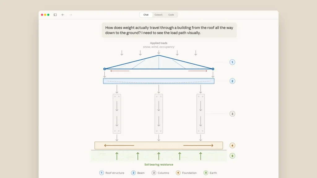
- You ask for an explanation of something with clear spatial or sequential relationships (“how does OAuth work?”, “explain a binary search tree”)
- You ask to compare things in a way that benefits from a chart
- You’re designing or architecting a system and a diagram would anchor the discussion
You can explicitly trigger it by saying:
- “Draw a diagram of…”
- “Show me a chart of…”
- “Visualize this for me”
- “Create a flowchart of…”
- “Can I see what this looks like?”
It won’t generate a visual when:
- You’re asking for pure text output (emails, code, essays)
- The answer is a number or a definition, no need for a chart to say “it’s 42”
- You’re requesting an Artifact or downloadable file (that routes differently)
How to Get the Best Results

Be Specific About What You Want to See
Vague prompts produce vague visuals. Instead of “show me microservices,” try:
“Draw an architecture diagram showing three microservices, Auth, Orders, and Inventory, communicating through an API Gateway, with a Redis cache between Orders and Inventory.”
The more context you give, the more accurate and useful the diagram.
Ask for Interactivity When It Matters
Claude can embed controls inside its visuals. This is especially useful for explainers. Try:
“Create an interactive visualization showing how bubble sort works, step by step, with a next button.”
Or:
“Build a compound interest calculator I can use directly in chat.”
These aren’t gimmicks, they’re genuinely useful when you’re learning something or prototyping an idea.
Use It Mid-Explanation
You don’t have to open with a visual request. Claude can insert diagrams mid-conversation as context builds. If you’re deep in a discussion about system design and realize a visual would help, just say:
“Can you draw what we’ve talked about so far?”
It’ll reconstruct the diagram from the conversation context.
Combine Visuals with Prose
Claude is designed to weave diagrams into explanations naturally, a paragraph, then a chart, then more text. Don’t feel like you have to choose between reading and seeing. Ask for both:
“Explain how DNS resolution works, and include a visual of the query flow.”
Practical Use Cases (With Real Prompts)
Here are some scenarios where the Visualizer genuinely saves time:
1. Explaining technical concepts to non-technical stakeholders
“Create a simple diagram showing how our app talks to a database, for a non-technical audience.”
2. Designing system architecture
“Visualize a three-tier architecture with a React frontend, Node.js API, and PostgreSQL database.”
3. Building quick data charts
“Plot a bar chart with these quarterly revenue numbers: Q1: $120k, Q2: $145k, Q3: $132k, Q4: $178k.”
4. Interactive learning tools
“Make an interactive explainer for how a TCP handshake works, with a next/back control.”
5. Comparing options side by side
“Show me a visual comparison of REST vs GraphQL vs gRPC for API design.”
What It Can’t Do (Yet)
Worth being upfront about the limitations:
- No image generation. The Visualizer creates SVG and HTML, not AI-generated images like Midjourney or DALL·E. Don’t expect photorealistic renders.
- No copyrighted characters or real people. It won’t draw brand logos, fictional characters from IP-protected properties, or depictions of public figures.
- Complexity is model-dependent. Claude Opus can handle deeply nested, multi-state interactive widgets. Claude Haiku keeps things simpler and faster. If you’re on a mid-tier plan, expect solid but not extravagant visuals.
- It’s not a design tool replacement. For professional-grade UI design, you’d still want Figma. The Visualizer is best for communication, exploration, and prototyping.
Visualizer vs. Artifacts – What’s the Difference?
This trips people up. Here’s the short version:
| Visualizer | Artifact | |
|---|---|---|
| Purpose | Inline visual in the conversation | Standalone file you can download/share |
| How to trigger | Ask for a diagram, chart, or visual | Say “create a file” or “make an Artifact” |
| Output | Renders in chat | Opens in a side panel, downloadable |
| Best for | Quick explanations, prototypes | Documents, apps, code you want to keep |
If you say “show me a diagram,” you get the Visualizer. If you say “create a file with this diagram,” Claude builds an Artifact instead.
Why This Matters for How We Use AI
We’ve been conditioned to think of AI chat as a text-in, text-out interface. The Visualizer breaks that assumption in a useful direction, not by making AI more “creative” in a flashy way, but by making it more communicative.
A diagram can replace three paragraphs of explanation. An interactive chart can answer a question you didn’t know how to ask. A step-by-step visual can teach something that a list of instructions can’t.
The fact that this happens inline, without leaving the conversation, without exports, without a separate tool, is what makes it actually worth using in a daily workflow. It removes friction at the exact moment when friction kills momentum.
Quick-Start Cheat Sheet
Save this for when you want to try it:
| Goal | Prompt |
|---|---|
| Flowchart | “Draw a flowchart showing the steps to [process]” |
| Architecture | “Visualize the architecture of [system]” |
| Bar/line chart | “Plot a chart with this data: [data]” |
| Interactive explainer | “Create an interactive step-by-step visual of [concept]” |
| Side-by-side comparison | “Show me a visual comparison of [A] vs [B]” |
| UI mockup | “Sketch a simple UI mockup for [feature]” |
FAQ
Does Claude’s Visualizer work on the free plan?
Yes, but more complex visuals, especially interactive ones, will be more capable on paid plans like Pro, where you have access to more powerful models.
Can I copy or download the visual?
You can right-click SVGs and save them in some browsers. For a proper downloadable file, ask Claude to create an Artifact version instead.
Will Claude always create a visual if I ask?
Almost always. The exception is content that falls outside its safety guidelines, things like graphic violence, real people’s likenesses, or copyrighted characters.
Is the Visualizer the same as Claude’s code execution?
Not exactly. Code execution runs Python and returns outputs. The Visualizer renders SVG/HTML directly in the chat interface. They’re separate capabilities.
Can I iterate on a visual?
Yes. Just say “make the chart blue” or “add a step between X and Y” and Claude will regenerate it with your changes.
Have you used Claude’s Visualizer in a way that surprised you? Drop it in the comments, I’d genuinely like to see what people are building with it.